
Yearly Sales Heat Map
When are your tickets selling? When are donations coming in? Is there a hot time of the year for activity from audiences? What day is most popular for people to donate? When do ticket sales actually ramp up?
These are all questions my Box Office Manager and I at the Lake Forest Symphony were asking. We felt that if we had a little more information about the buyer, we could reshape how we market/interact with them and when. We were in an particular situation where we had access to some data over the years, but not all. And, we didn’t have a good way to show the data.
For anyone who has a CRM, it’s possible that can churn this data out for you automatically. However, we were in a situation where this wasn’t possible.
I’m a fan of analytics and “big data”. In every non-profit I’ve worked in, I’ve always tried to implement more analytics. We know that all sorts of companies big and small are trying to find more information about us, the customer.
Hell, how many times have you had that moment when you’re discussing a topic and then the next time you look at your phone, there’s an ad for exactly what you were talking about.
In my experience, the arts are far behind on data mining. I’ve met folks who still preach that if concerts are good enough, audiences will attend. I wish that were true, I really, really, really do. But unfortunately, it’s just not what I’ve seen. Perhaps this is my own lonely experience, but good enough has never been good enough.
We’re not usually harnessing the power of data, or if we are, perhaps we don’t have the capacity to make the changes we want to. The first step in making changes is to find the information. As a great man once told me, “we don’t know what we don’t know.”
So, let’s ask a specific question about our customers. What day do buyers buy? This seems remedial and obvious, right? If we knew this, we would plan our social media and e-blasts around those days. If you’re using social media and email platforms like Constant Contact, EMMA, and MailChimp, you can also see what days/times are best for your e-blasts and posts. Now let’s add an additional element showing what day people actually act in your box office.
I’m a visual person when it comes to information. Reading information or data sets never seemed to stick in my head as well as visualizations did. I like charts. Of course, there are many ways to analyze and learn from your data. This is just one way to visualize the data differently. I found that Board Members, staff members, volunteers, and donors appreciated new ways to look at our data.
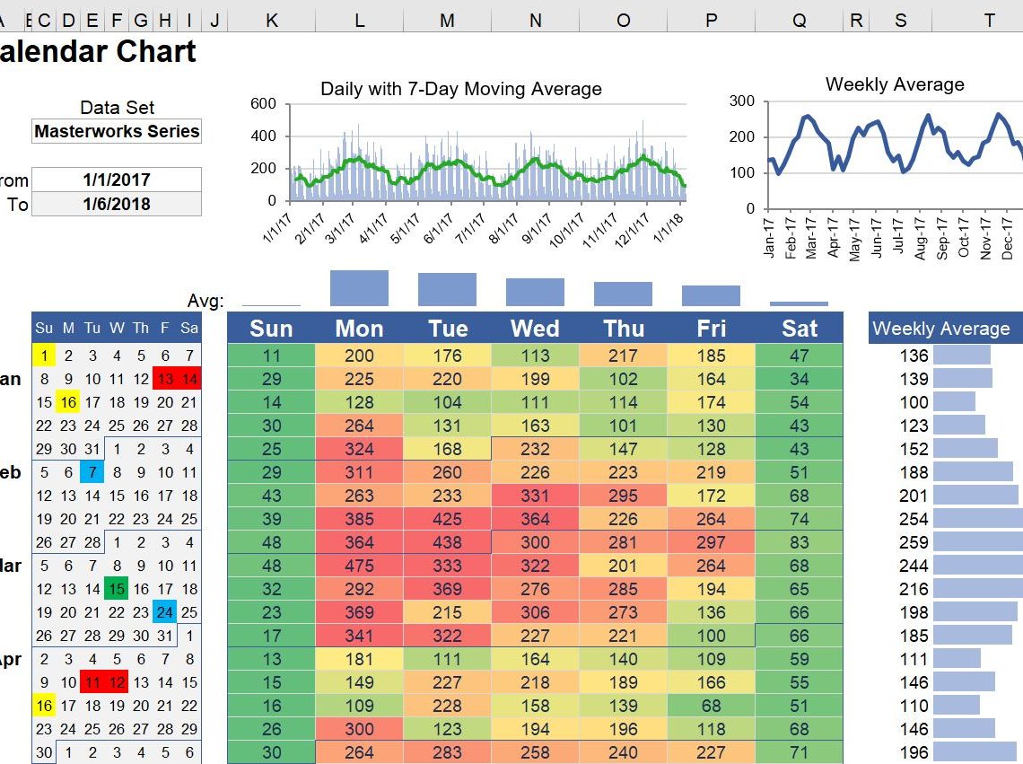
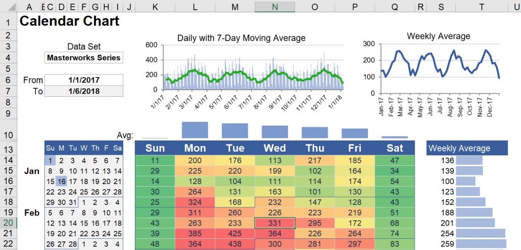
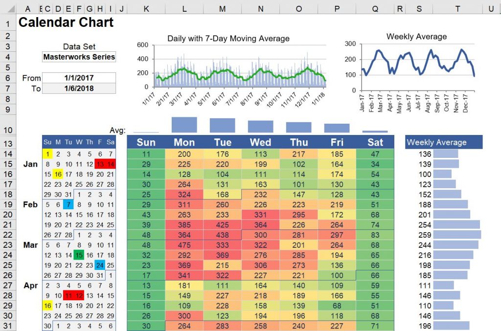
Here comes the Sales Heat Map. I found a template from Vertex42.com that fit exactly what I was looking for. To be clear, I didn’t create this document. I did modify it some for my own use, but Jon Wittwer is the genius behind this document.
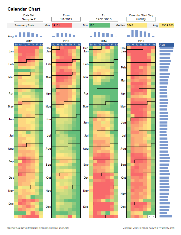
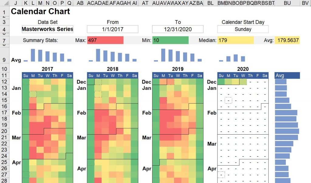
Here we have data from one year and from multiple years in a clean visual format. Through this document we can see the following:
- What day of the week was the best day for sales
- When in the year was the best (and worst) times for ticket sales. When are we weakest in ticket sales?
- What was our weekly average
- What was our daily average
- We could also compare multiple years to see any fluctuations or patterns
- The template also allows for multiple data sets. We would be able to compare a variety of data sets over time. For example, you can compare student ticket sales, regular ticket sales, donations, etc. Hell, you could track how many emails or phone calls you get if you really cared to know.
Set Up
Step 1
To download the template head to https://www.vertex42.com/ExcelTemplates/calendar-chart.html and download the Excel file.
Step 2
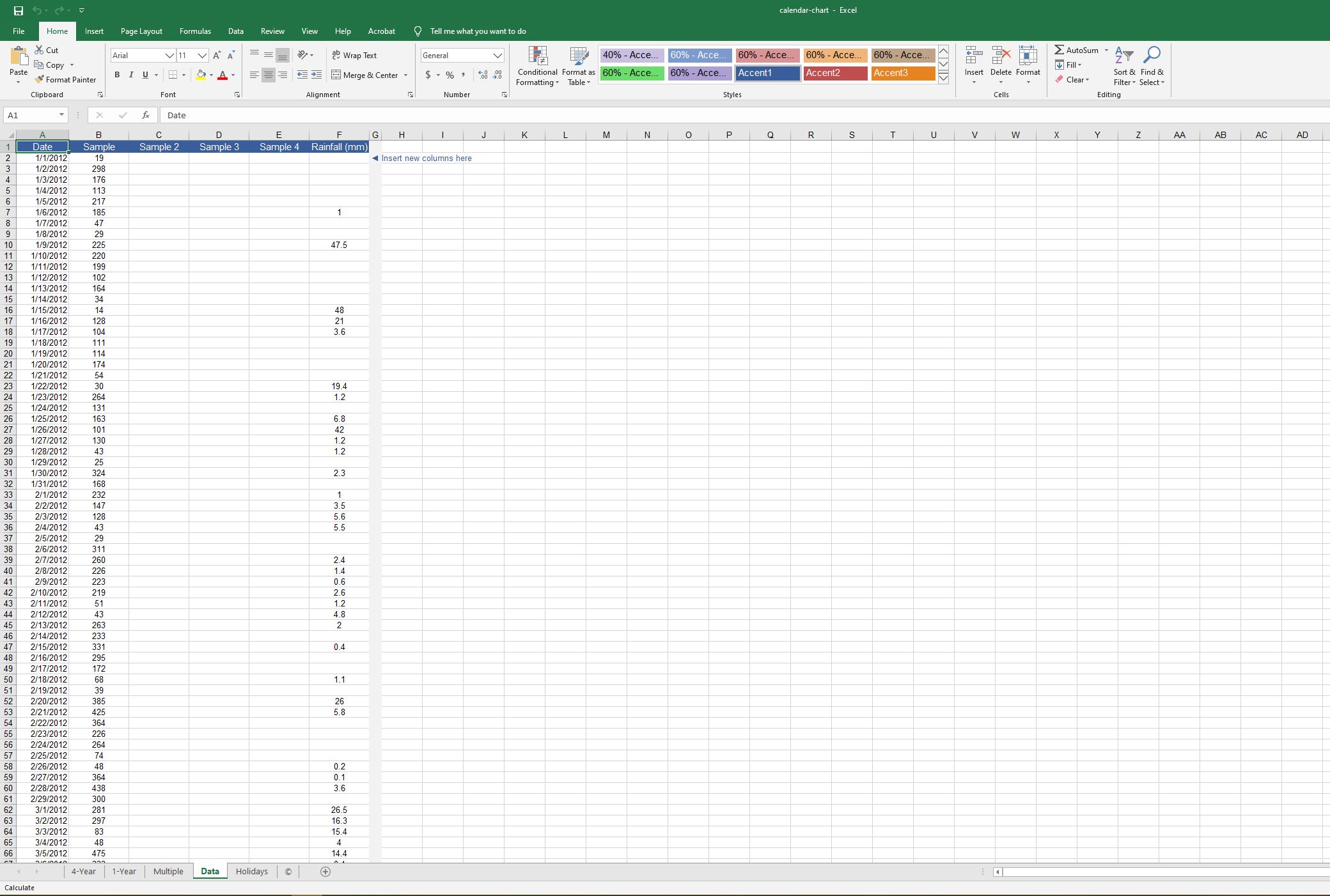
I recommend saving this as a new file before starting the modifications (just in case something goes horribly wrong). Once you open the document, you’ll see tabs with a 4-year model, 1-year model, multiple data sets, data (where you input your data), and holidays.
Let’s use this template to analyze ticket sales by number of tickets sold over a twelve-month period.
Step 3: Data Tab
Here you can insert your data, for our example it will be number of tickets sold each day.
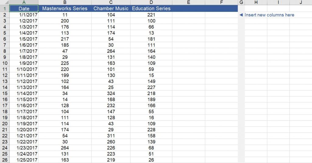
- Update the dates in the first column with the days/months/years you’re working with. (I decided to start with January 1, 2017. I’m also using fake data as an example.)
- In
B1, C1, D1, etc.(to the right of Date), rename the headers to your series titles. - Starting in
Row 2add your number of tickets sold. I recommend using whole numbers (no decimals). If you had no sales on a day, input 0, that is still a relevant data point. - You can input as may data sets (columns to the right of Date) as you want and you can input as many days (rows) as you want.
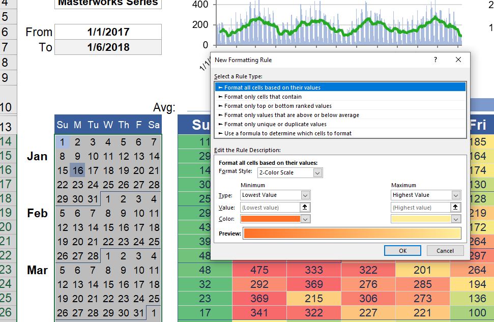
- In the top left corner of the 1-Year tab, you can select which date set you’re accessing and set the start and end dates.
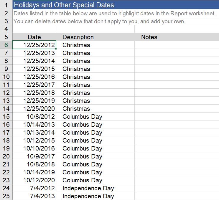
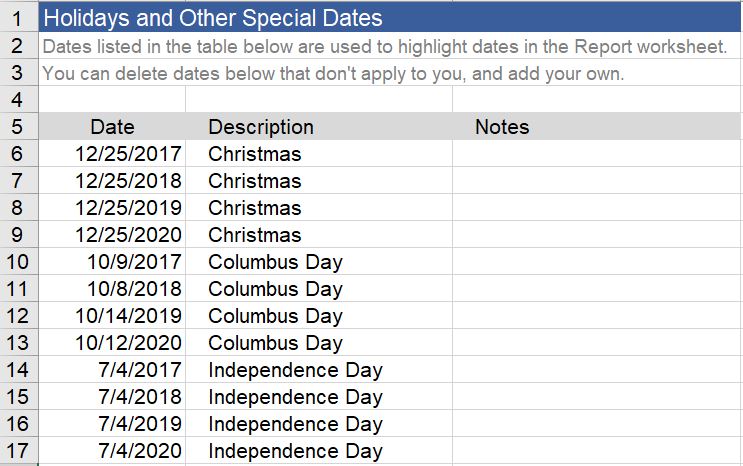
Step 4: Holidays Tab
Make sure these holidays are up to date with your time frame. You can also add new holidays that you want to include. These holidays are highlighted on the miniature calendar left of the heat map in the 1-Year tab. This data is relevant because we know that holidays impact attendance and sales.
Step 5: Concerts Tab
- Create a new tab and name it Concerts.
- In
row 1name your series - In
row 2add the heading Date, Description, Notes - In
row 3begin your data
- In
- Rename
column Ato the title of your series. (Example: masterworks, chamber, education, pops, etc.) - Insert the dates of your concerts. I’m using fake dates in this tutorial, but what you input here will show in the mini calendar on the 1-Year tab.
- In
column B“Description”, add the title of your concert series (Masterworks Series, Education Series, Chamber Music Series, etc.). - To add an additional series, copy the header from
cells A1-C3 and paste in D1. This will add your second series. You can replicate this process to add more series to the right. - **Rename the column of any of your other series. Select
column Dand left of the function bar, input the name of the series in a simplified word (masterworks, chamber, pops, etc.)**
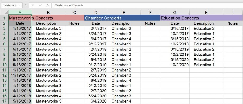
Tip: You could also add a set for fundraisers and show when your fundraising events were.
You should see in 1-Year tab a heat map of your data set. You can select the different data sets in the drop down menu from
cell C4.
Step 6: 1-Year Tab
Now that you have input your ticket data, holidays, and your concert dates, we need to make the 1-Year tab pull that data.
- In the 1-Year tab, select and highlight the first date on the miniature calendar (
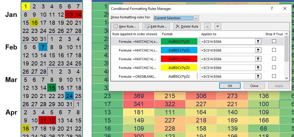
cell C14) and select through the last date of the year (cell I66). - Then, add conditional formatting by selecting Home>Conditional Formatting>Manage Rules.
- You’ll see a lot of different rules that control when different cells are highlighted and what colors they are. The rule that is controlling whether the holidays are highlighted is
=MATCH(C14,holidays,0)
- You’ll see a lot of different rules that control when different cells are highlighted and what colors they are. The rule that is controlling whether the holidays are highlighted is
- Create a new rule
- Under Rule Type select use a formula to determine which cells to format
- Insert the formula for your series using your simplified name which you selected in Step 5 (masterworks, chamber, pops, etc.)
=MATCH(C14,chamber,0)
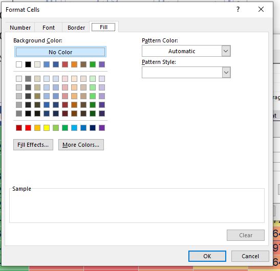
- Format the color of highlighting by select Format (On a Mac you want to Format with: and select custom format)
- Go to the Fill tab and here you can select the color that will highlight the date of your concert in the mini calendar. I suggest bright colors because this is a mini calendar. The goal is for this to be a visual representation of your season, so don’t pick a light grey or a color that won’t print clearly. Also, if you brand your different series with a specific color, use that color. It’s easier to remember which is which.
- Select OK
- Finally, back in the Manage Rules menu, under “Applies to” column the cells you selected originally should already be set. If they’re not listed, the the formula you want to use is
=$C$14:$I$66('1-Year'!$C$14:$I$66on a Mac)- Click OK
If you have selected the correct date range, you should see your concerts highlighted in your selected color in the mini calendar in the 1-year tab.
Note: In the 1-Year tab you can set the start date of the heat map calendar in
cell W7.
Step 7: 4-Year Tab
- If you have input more than one year of data, go to your 4-Year tab and select your data set, set your dates and your calendar start day. You should see a visual representation of your data over 4 years.
Step 8: Multiple Tab
- Select the data set you want to view and set the start date for each series. You will need to do this for each comparing set (
cells K4, AC4, AU4, BM4) - Now you can compare how ticket sales were for the different series, or perhaps between the same series over different years.
Conclusion
Personally, I found the 1-Year tab and the multiple data sets the most useful for our data. Now you have a terrific way to visualize your data. So what dates are best for ticket sales?
Special thanks to Vertex42.com and author Jon Wittwer for the starting template!